Industrial power, sharpened. An identity for the workforce behind the turbines.
- Brand identity
- Stationery
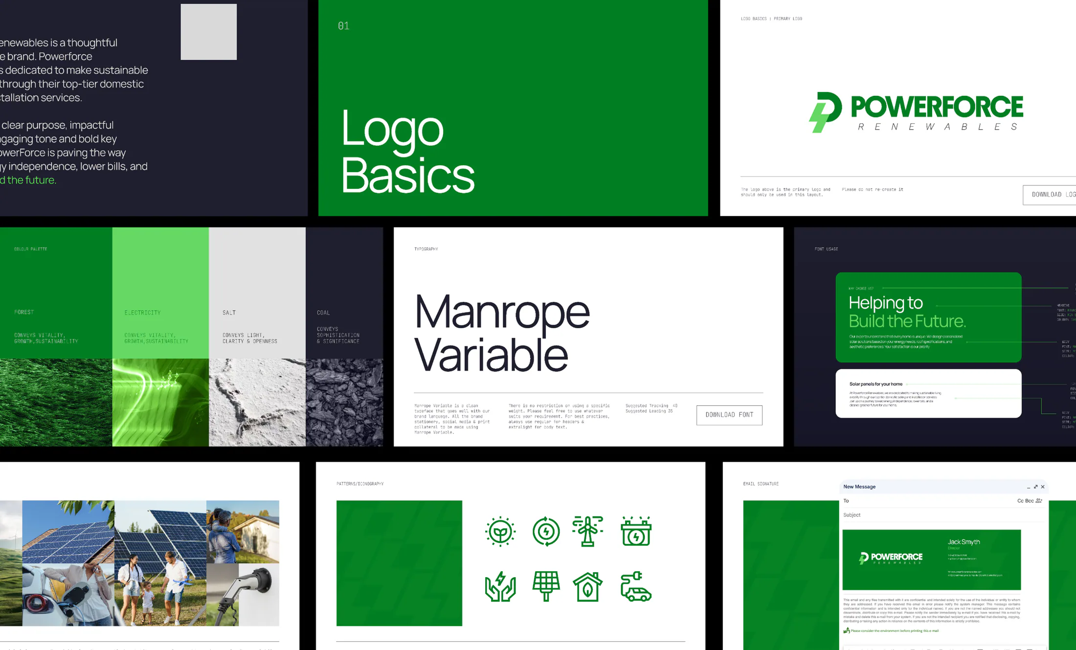
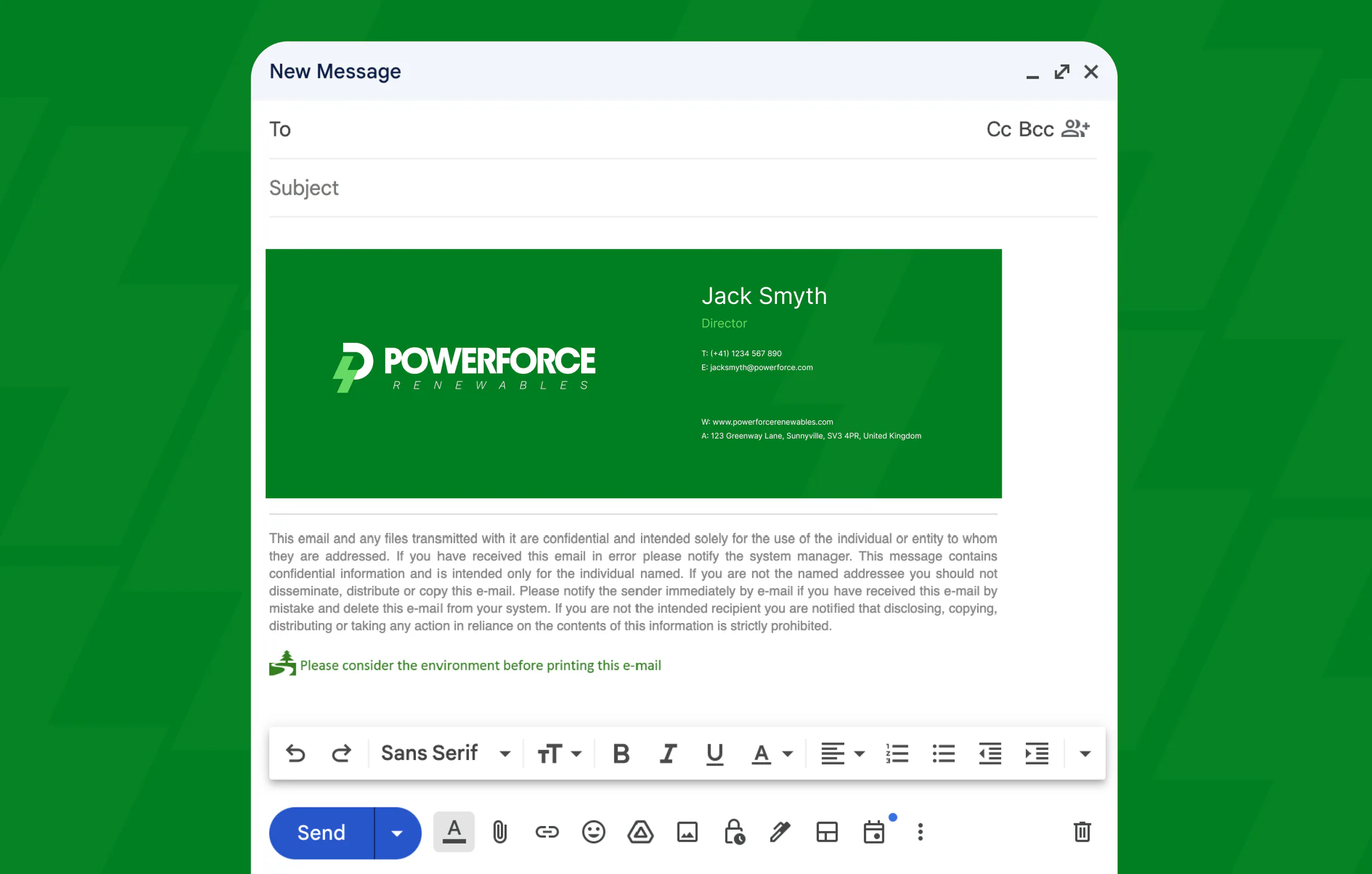
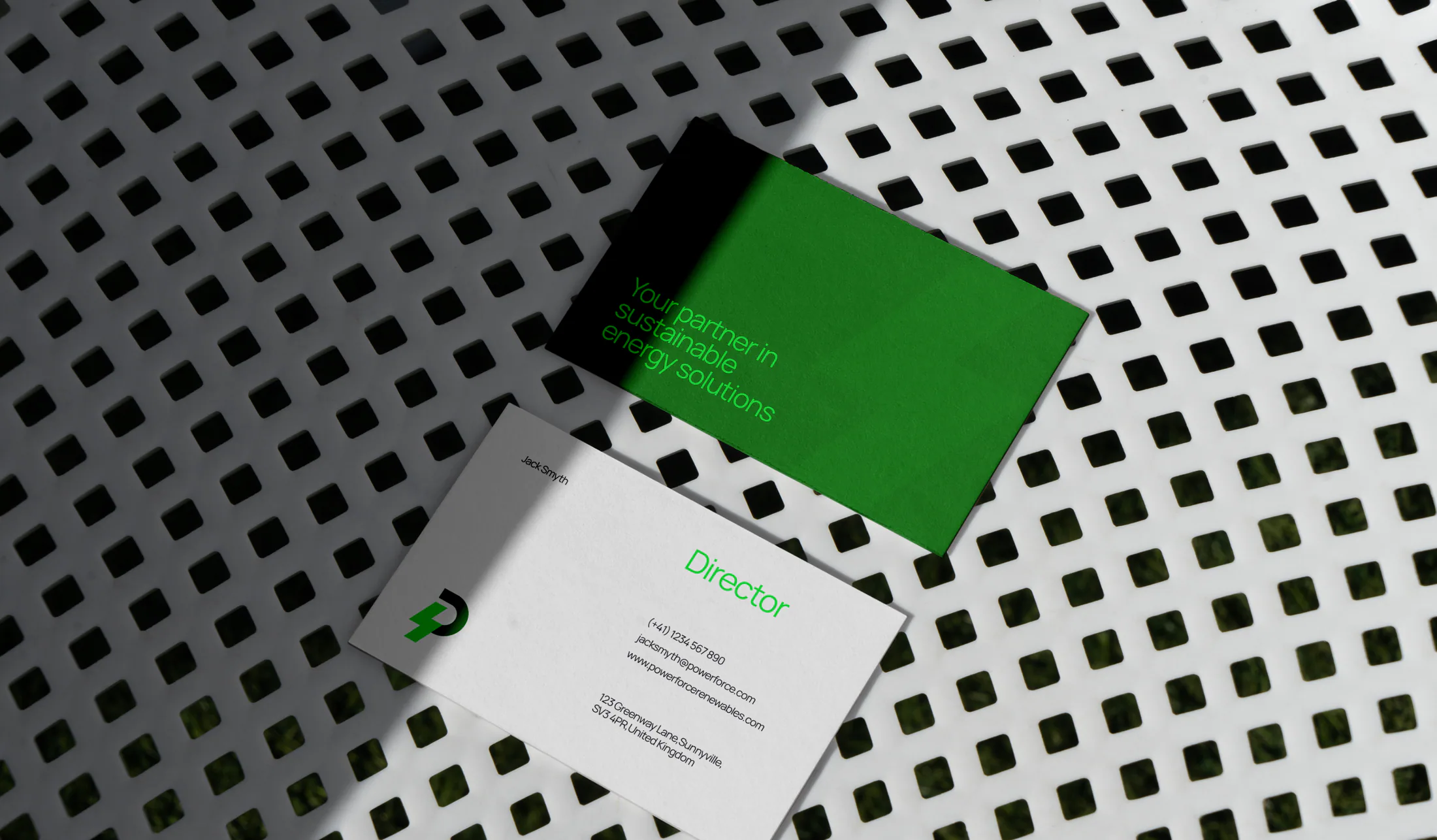
Powerforce supplies skilled labour to the renewables sector, serious work that deserved better than clip-art hard hats. A stripped-back industrial identity, applied with precision across stationery, print and site collateral.
The challenge
Labour supply to the renewables sector is a serious, safety-critical business, but the category's branding runs on clip-art hard hats and gradient swooshes. Powerforce was pitching to major energy contractors while looking like a job board. The brand was actively working against the calibre of the workforce behind it.
The approach
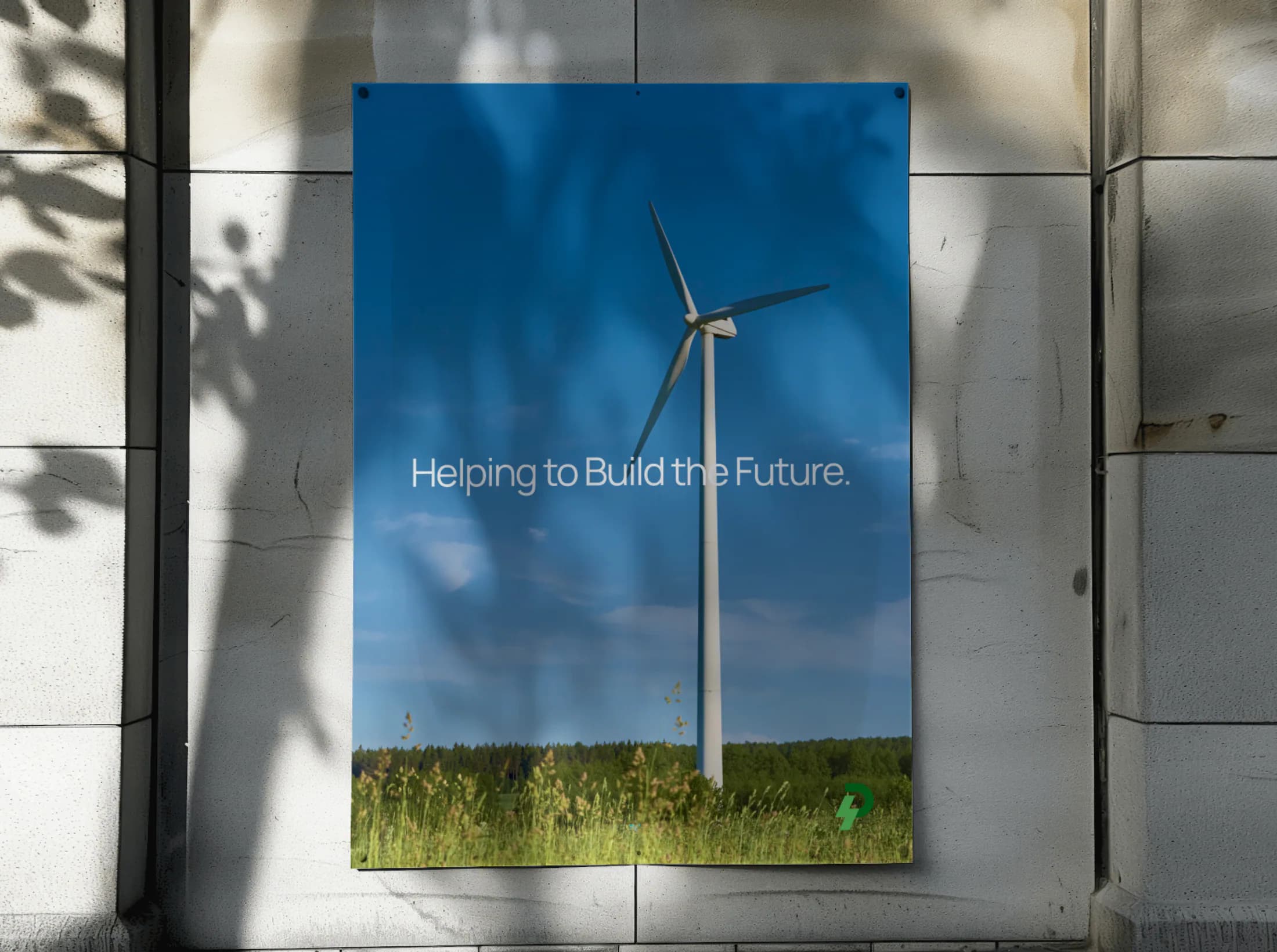
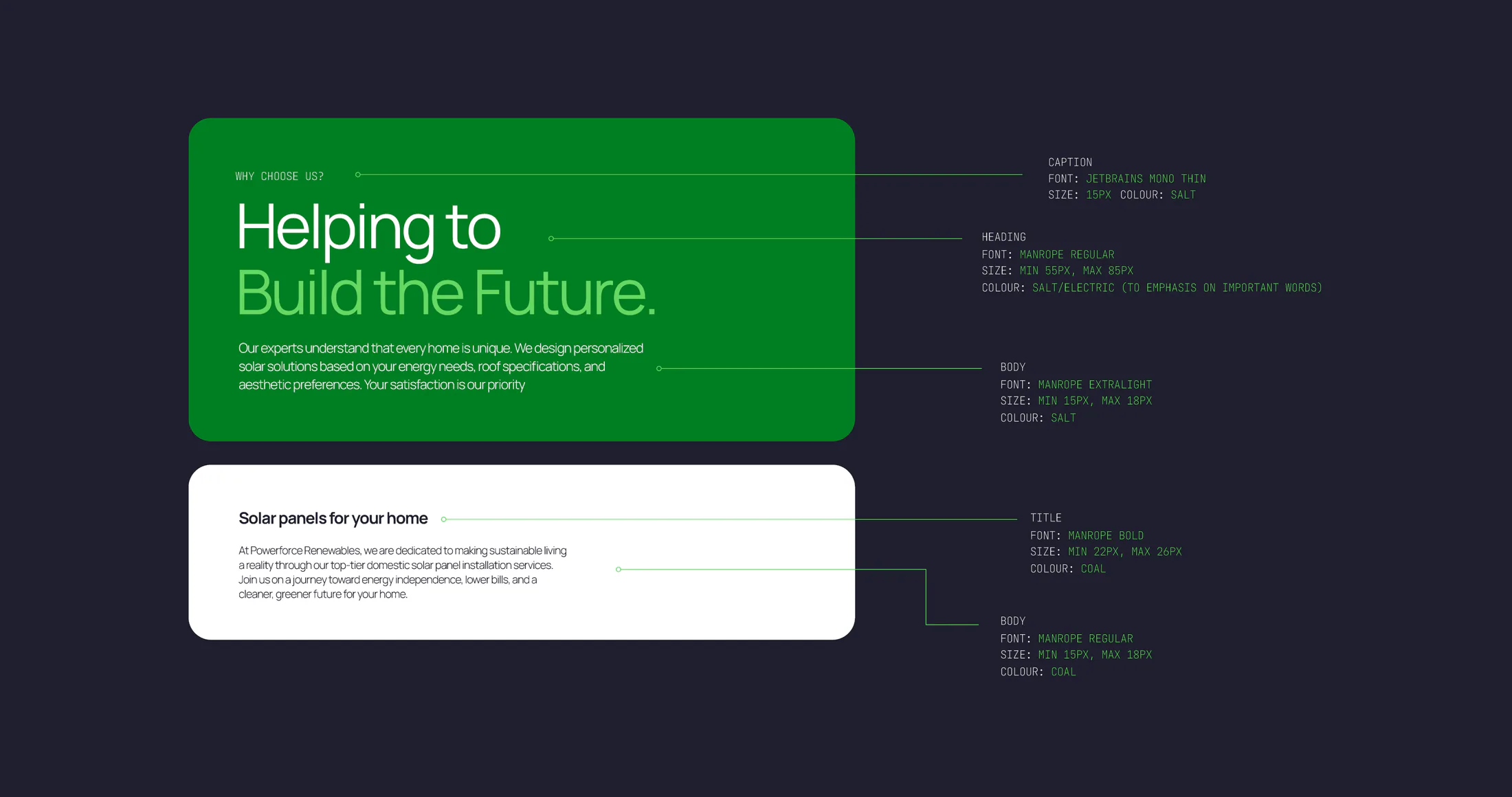
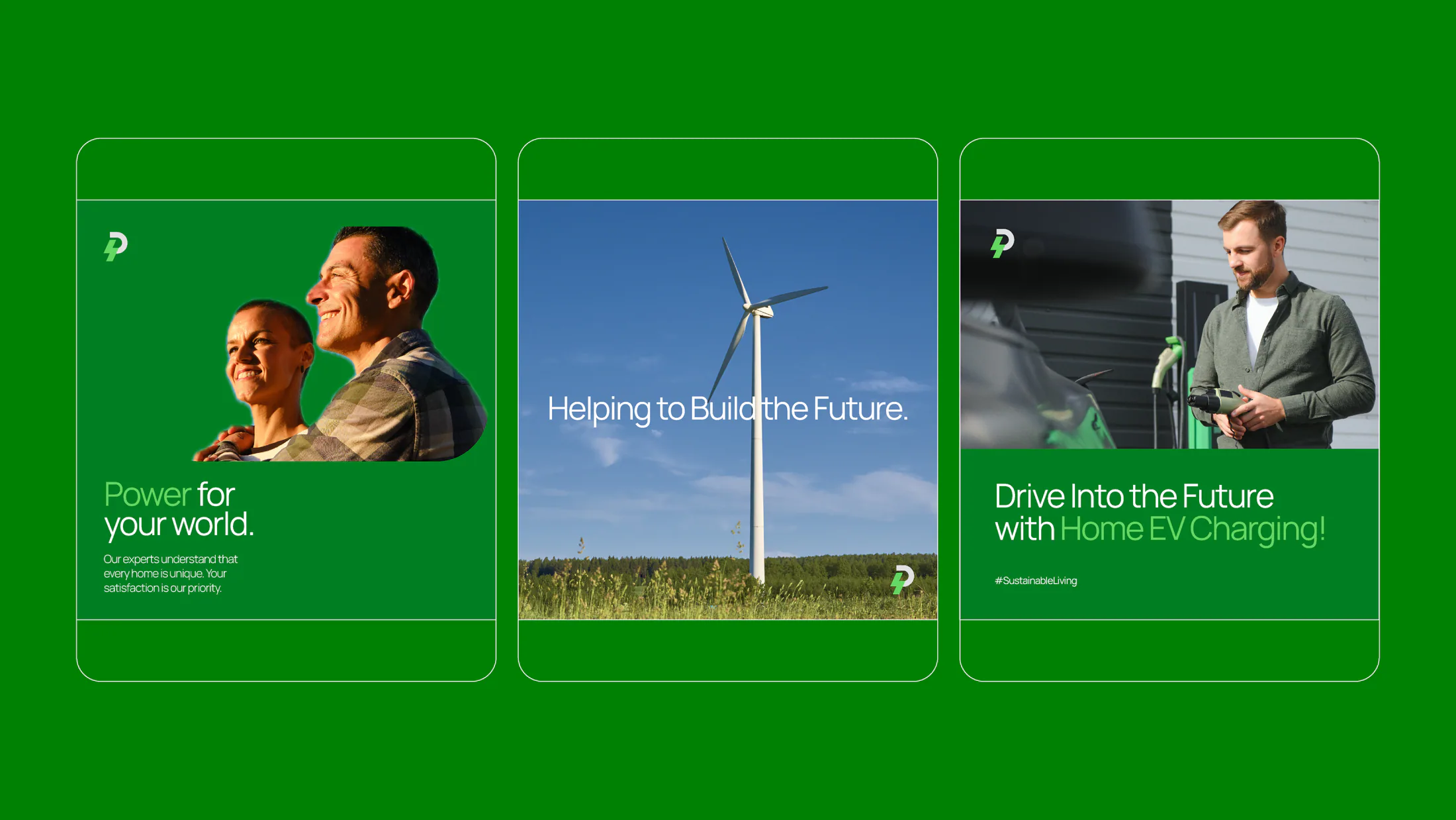
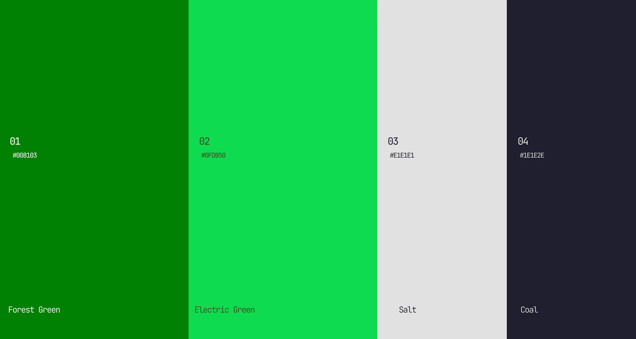
We stripped everything back to industrial fundamentals: a hard-edged mark, utilitarian type and a restrained palette that borrows its confidence from engineering rather than marketing. Then we applied it with precision across the touchpoints that matter in this sector, from stationery and tender print to posters and site collateral, where consistency itself signals operational discipline.
The outcome
Powerforce now looks like the standard of workforce it supplies. The identity holds its own alongside the major contractors it pitches to, and every printed piece reinforces the same message: serious people, serious work.


Want work like this on your brand?
One subscription, every kind of design. Your first request could be back this week.
200+ brands built · 6 years as an agency · No contracts · Pause anytime
Next project
EJW Concrete
Campaign