
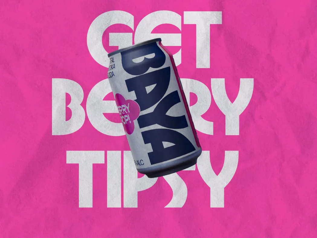
Crisp brand, crisper cans. Identity and packaging for a better vodka soda.
- Brand identity
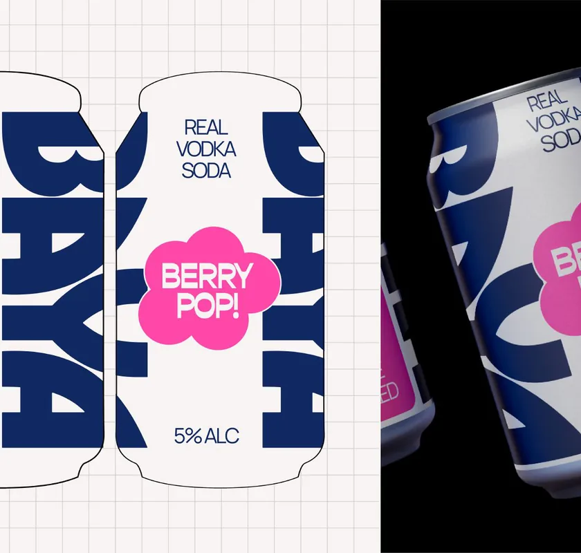
- Packaging
- Poster campaign
Baya had a better recipe and a crowded shelf to win. The brand went bold and simple: a punchy identity carried onto cans and posters that read from across the room, not just across the bar.
The challenge
Ready-to-drink is one of the most crowded shelves in retail, and every can is fighting for a glance that lasts under a second. Baya had the better recipe, but recipes don't win fridges. The brand had to do it, at arm's length, in bad lighting, against a wall of competitors shouting in pastel.
The approach
We went bold and simple where the category goes busy. A punchy identity with one big idea per surface, colour that owns its shelf position, and typography sized to read from across the room rather than across the bar. The same system carries from can to poster to point of sale, so every appearance compounds recognition instead of restarting it.
The outcome
Baya now gets picked up before it gets read. The cans hold their own on a crowded shelf, the posters work at a glance, and the brand gives a better recipe the first impression it deserved.
Want work like this on your brand?
One subscription, every kind of design. Your first request could be back this week.
200+ brands built · 6 years as an agency · No contracts · Pause anytime
Next project
SaleSprout
Brand & Signage